|
July 20th, 2001
Clow Shrine
http://www.theclowbook.com
 (1 star)
Layout and Design:
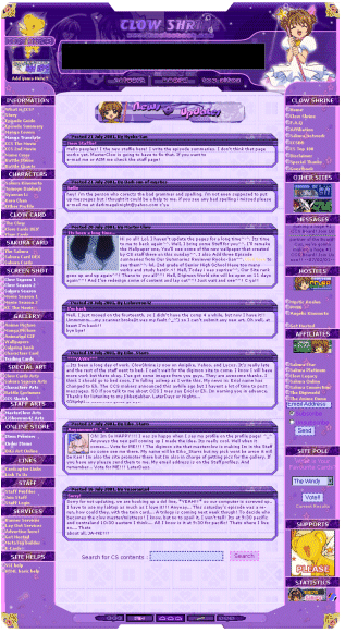
Well, they offer layout service, but their layout isn't so great. The graphics are poorly put together and you can see all the seams. They fuzz around the Sakura picture at the top so as to make it less bad, but that doesn't help and it just looks amateur. The design itself is of course, the same as so many other websites out there. Is everyone just copying off each other, or can they really not figure out a better way to make a site?!
I'd also like to say that their load time is so slow. I'm not sure why though, and it really is only their site. Maybe it's the 10,001 pop-up ads....
0 out of 2 stars
Organization:
Ummm... no.
0 out of 2 stars
Broken Links and Pop-Ups:
Kids, this site has more pop-ups than the 4th of July. Good grief. Every 2 seconds there was something else. Not to mention they have two banners on every page trying to get you to click their ads with
silly CCS graphics. Hey, get a job if you want money. Advertising on the internet is as good as dead. So stop wasting your time and everyone else's with ridiculous products that no one is going to buy. (Like the fabulous mini-spycam!) By the way, just because you make your own 404 page, doesn't mean that's not a broken link.
0 out of 2 stars
Content:
Stolen second summary.... the same place Clow Legacy stole from in fact. You can check that review. And I know that no one on their staff wrote the first movie summary either. It's ridiculous what people try to pass off as their own. And obvious. When someone's writing style suddenly changes and they begin to include more details, you know something is up.
Sheer irony here. This message was displayed on the front page when I came to look at the site.
hey! i'm the person who corects the bad grammar and spelling. i'm not even supposed to put up messeges but i thought it could be a help to me. if you see any bad spelling i missed please e-mail me at darkmageknight@yahoo.com c'ya
Whoa! Perhaps they're going to need two people for this task considering in this kid's one message he/she manages to misspell "corrects" and "messages."
Is it wrong that I couldn't find anything good to mention here?
Ah wait! I found something. They have screenshots from the Kero-chan short that went with the second movie. I guess that's worth a mention. And a point, just cause I've never seen those anywhere else.
1 out of 2 stars
Overall:
I don't like this site at all. And I had nothing against it to start out with. But maybe it after being bombarded with pop-ups and reading stolen summaries, my feelings might have changed. That and the collection of broken links, image and otherwise, I could barely stand this site. How did it all go so wrong?
0 out of 2 stars
1 out of 10 stars. I think it's a new record...
Hey guys, clowreadshrine@yahoo.com
attempted a reply. Read below. And for anyone else, if you
want to write me something, please write me something
intelligible.
this is constructive C&C - i don't
want to have my site reviewed, i
want to review yours review yours
i think you talk so much about
how other peopls sites suck you should take a quick glance at
yours once in a while i mean come
on! this big while table is
extremely ugly...sure it may be quick loading but with the
image of yue at the top and all. you could do better. a
huge white table like this is such an eye sore. and hosted on
tripod? do you even know html? sureley
one that judges sites so much should know of a better host
without banner adds or popups.
i know of several.
i know the form wasn't mean for this purpose, however i
didn't want to e-mail you because i
don't want a reply from you o_o and seeing as I haven't
found a guestbook around here....
P.S. - speaking of fast loading...try working on that enter
image, hmmm?
|
|